OVERVIEW
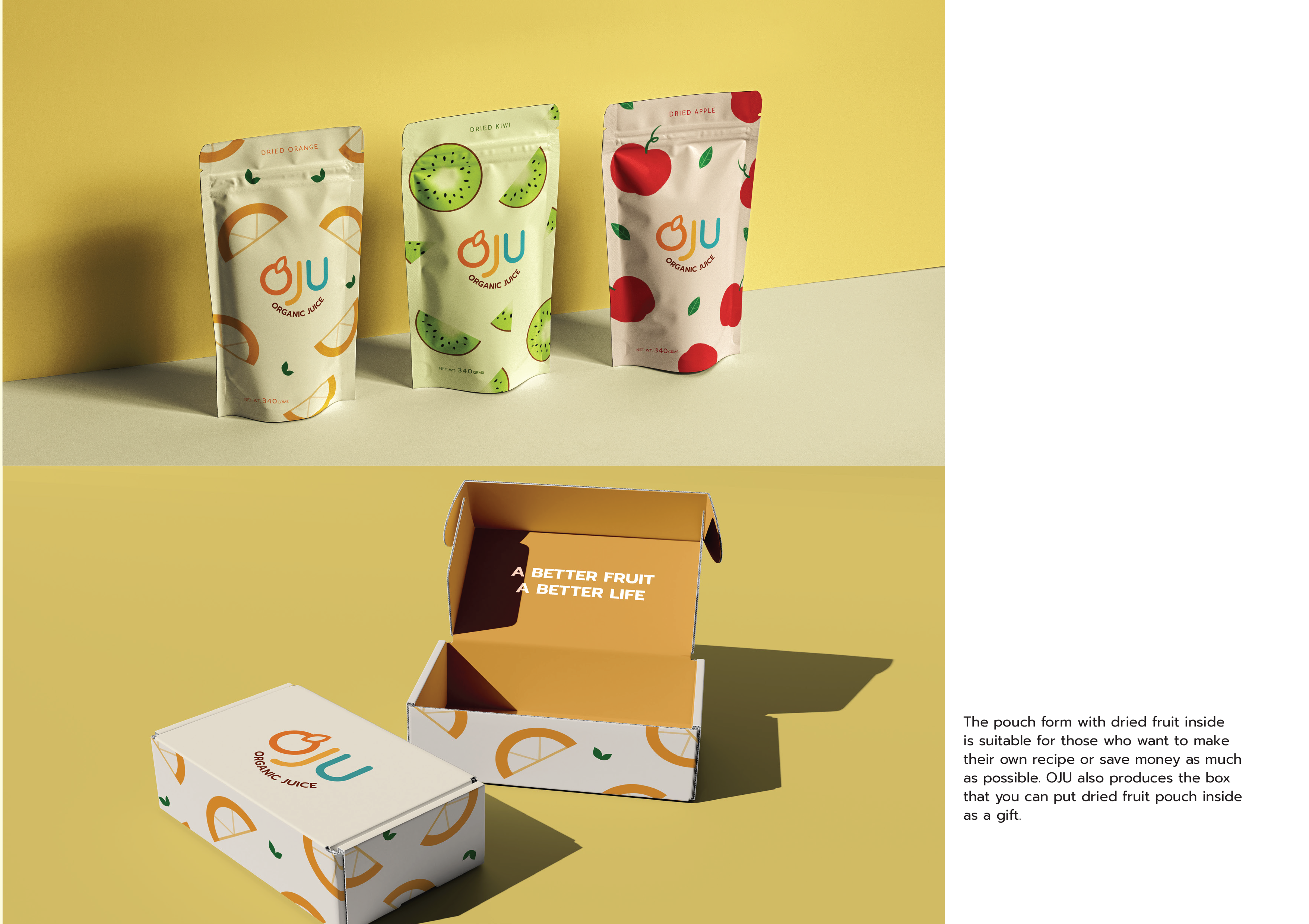
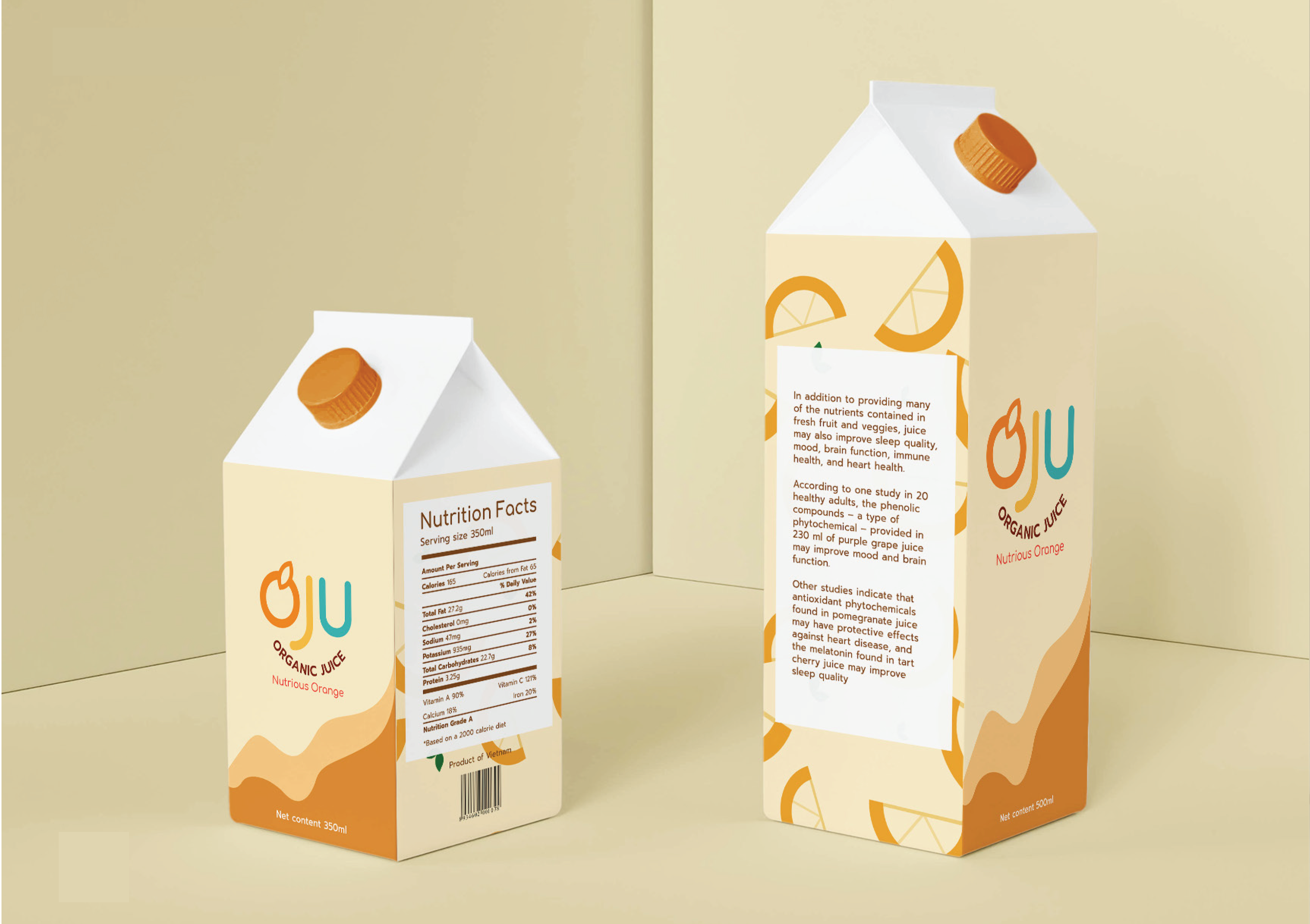
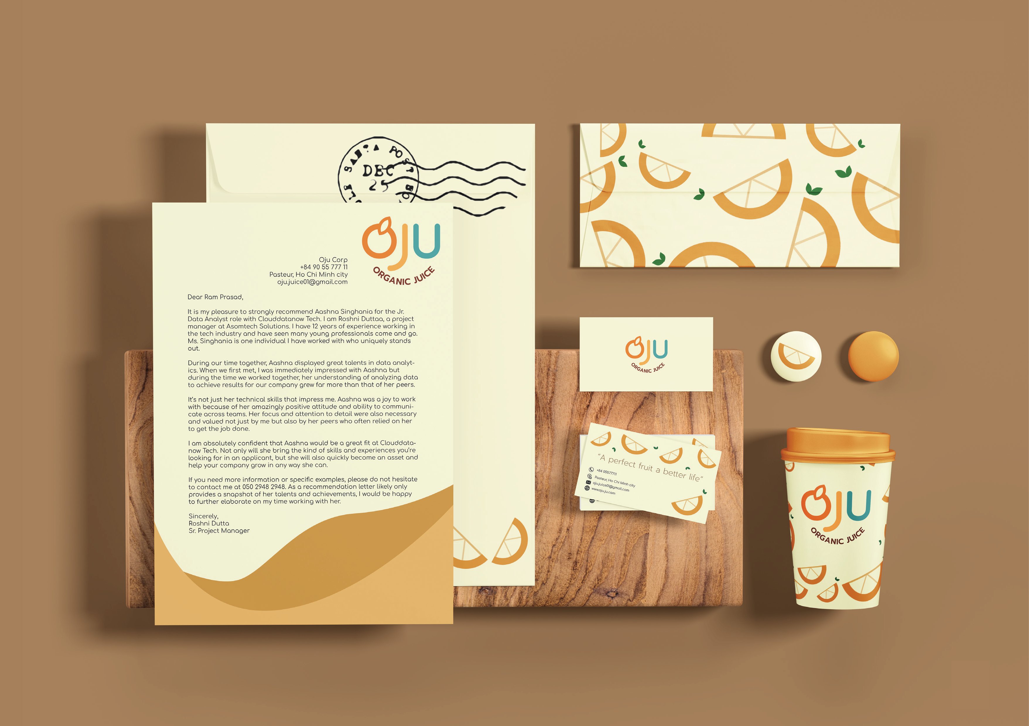
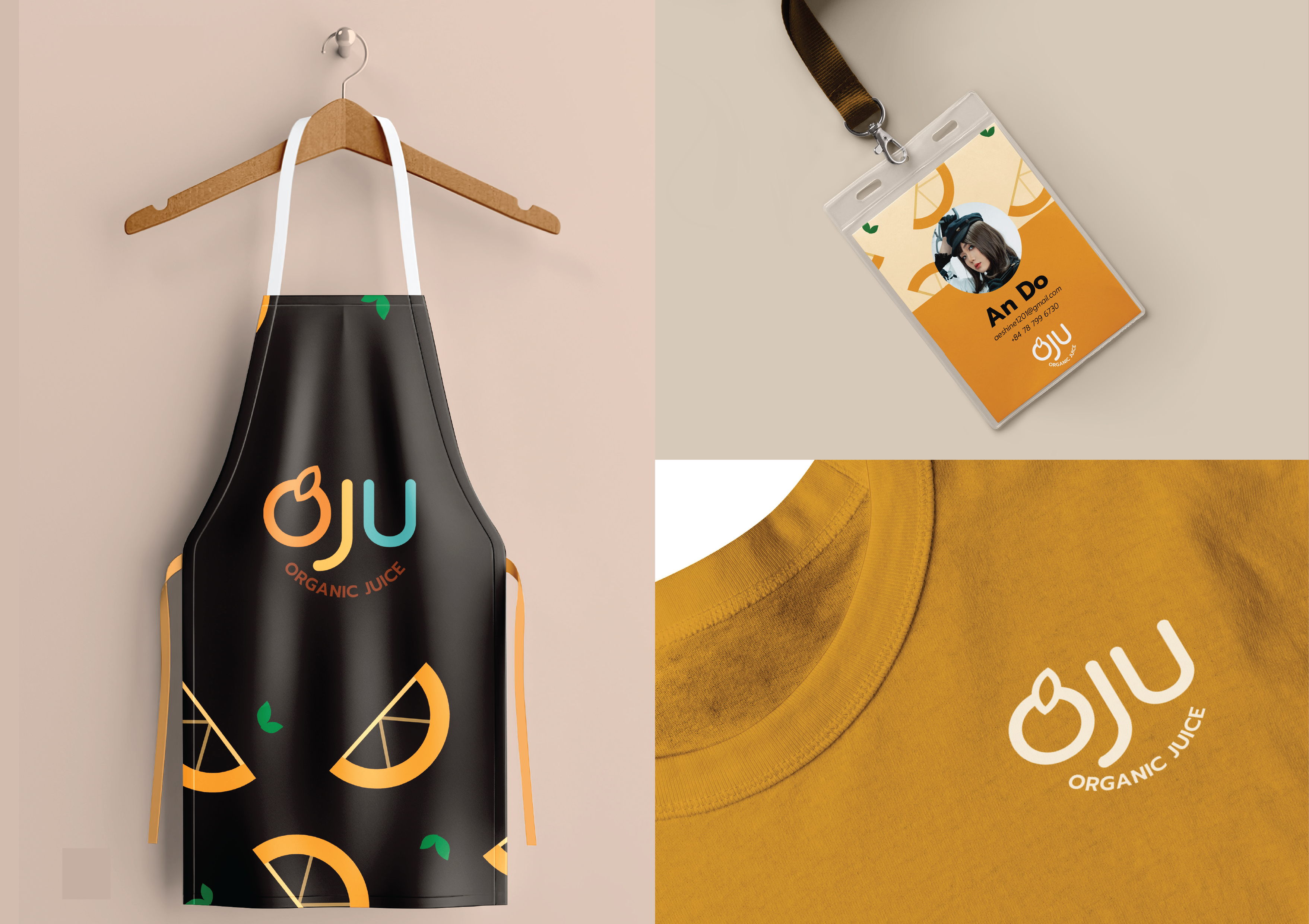
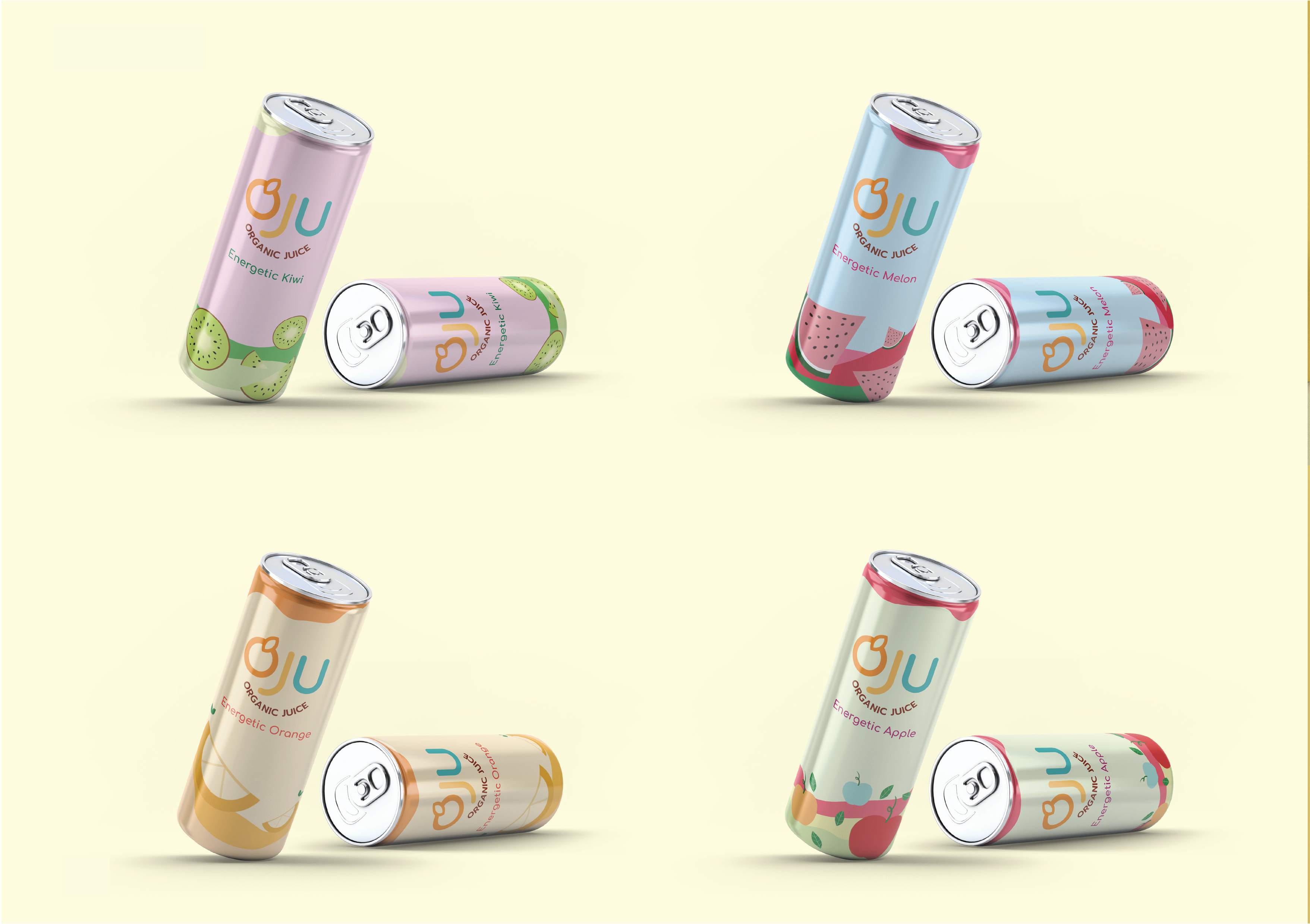
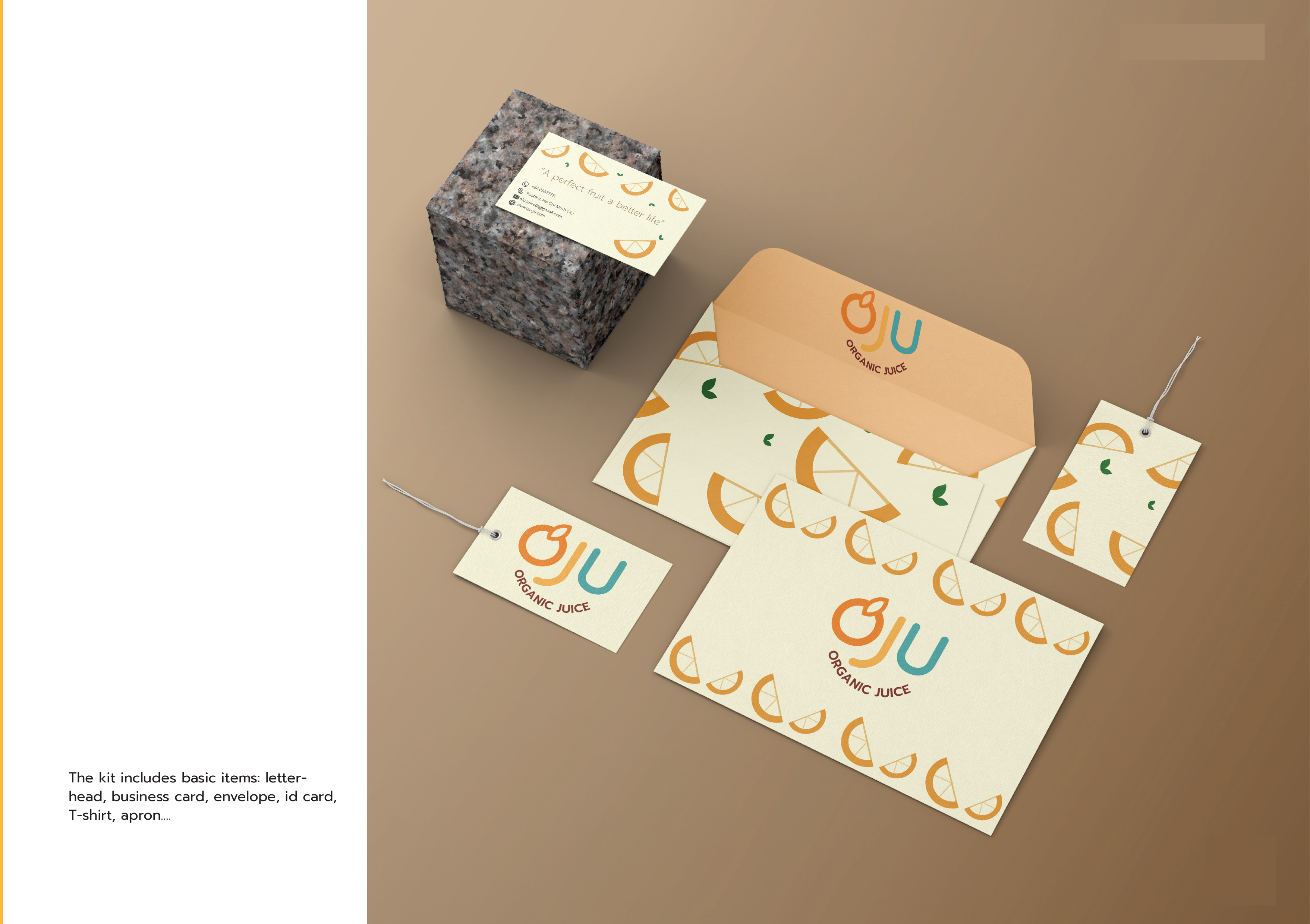
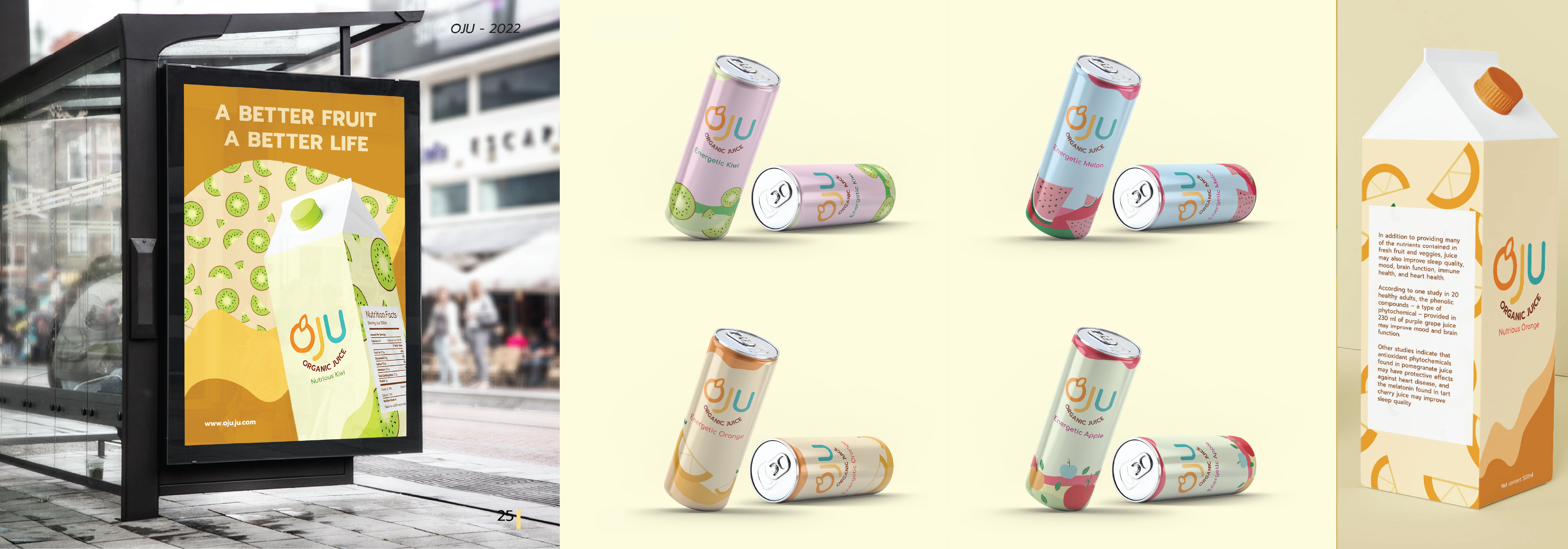
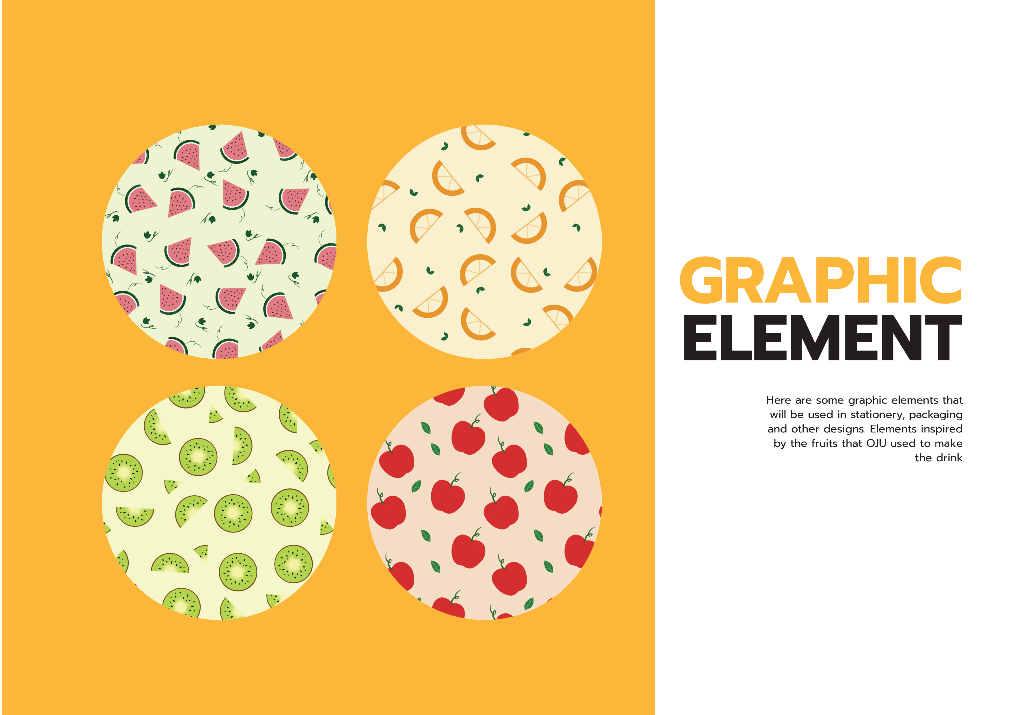
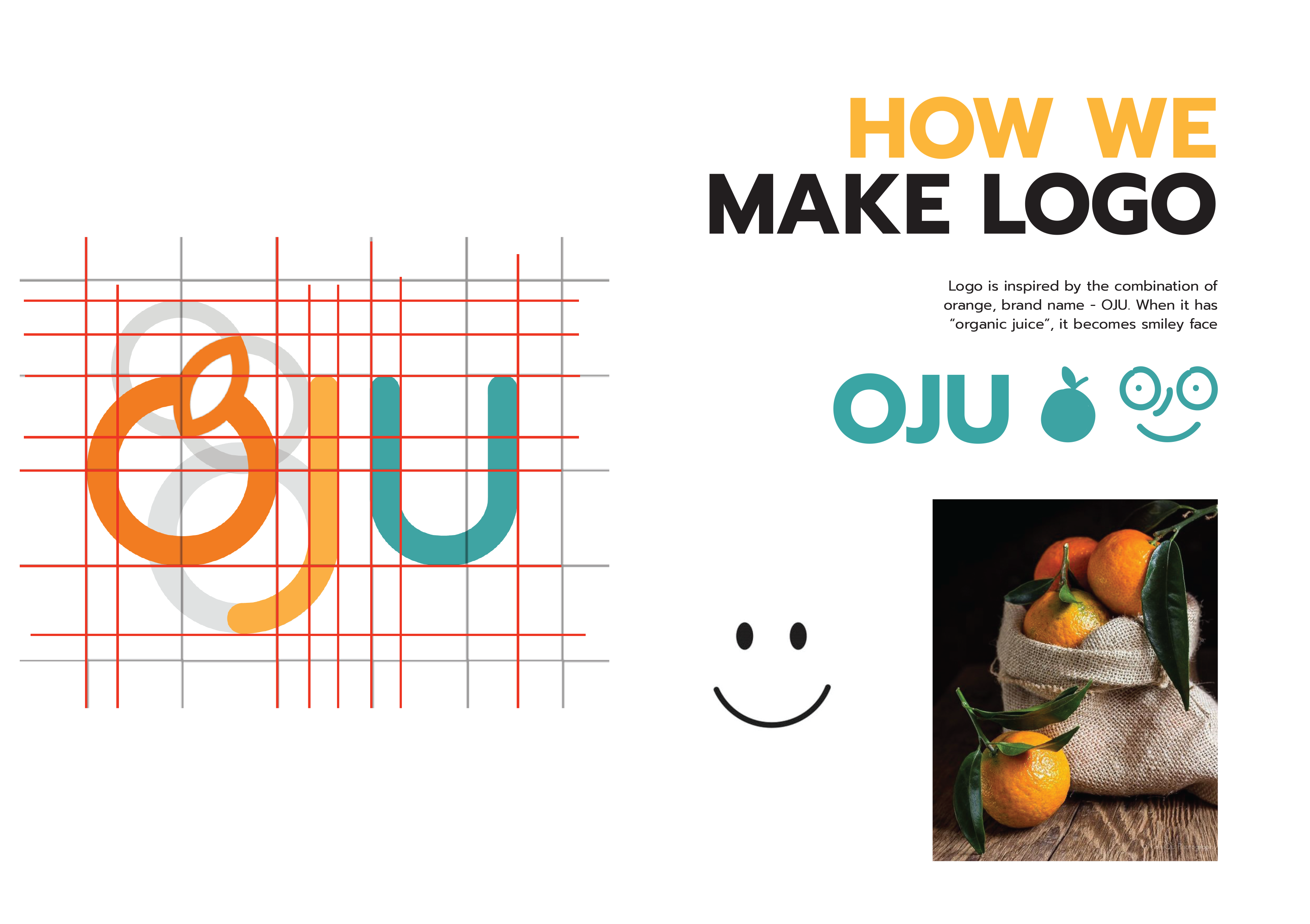
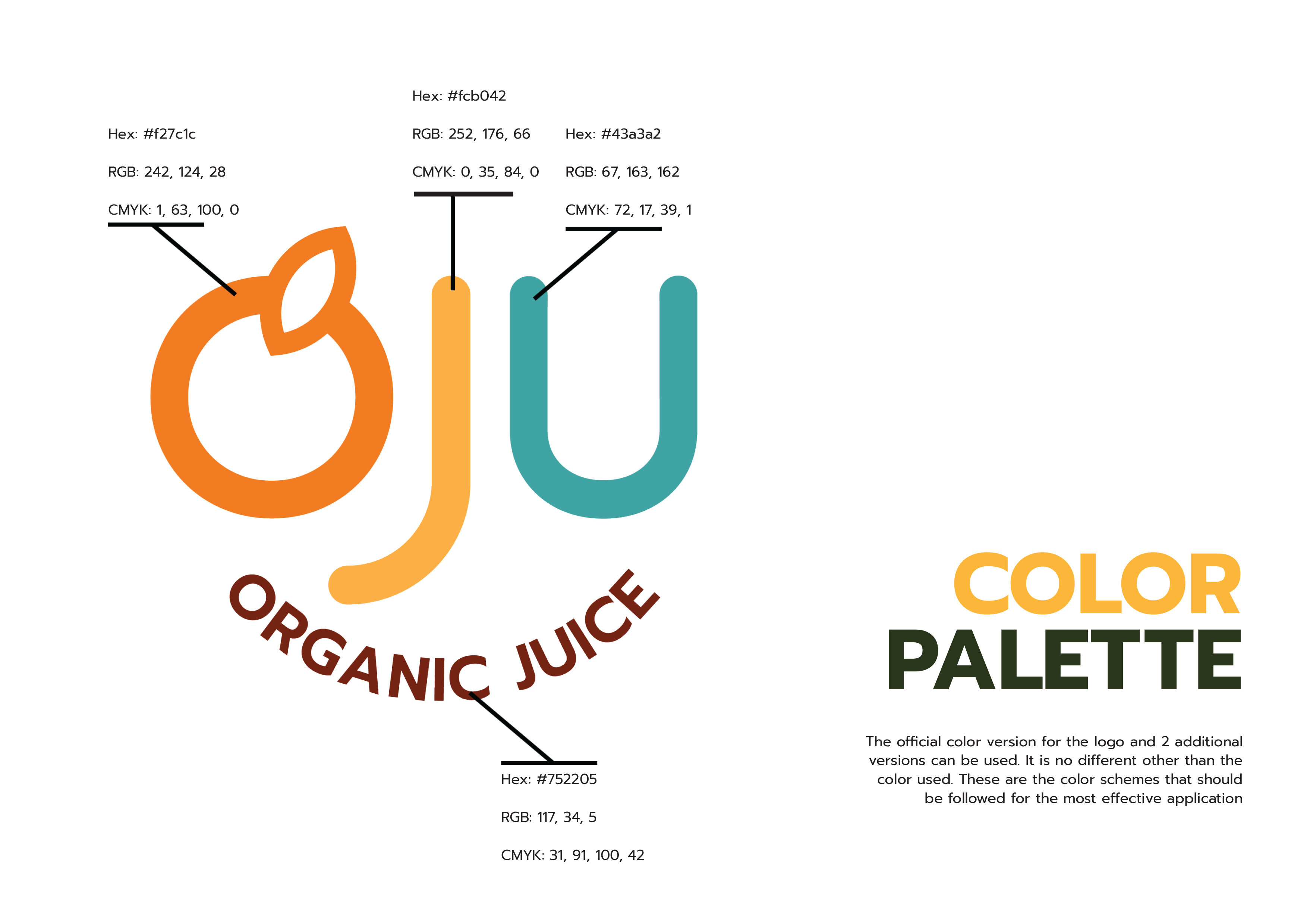
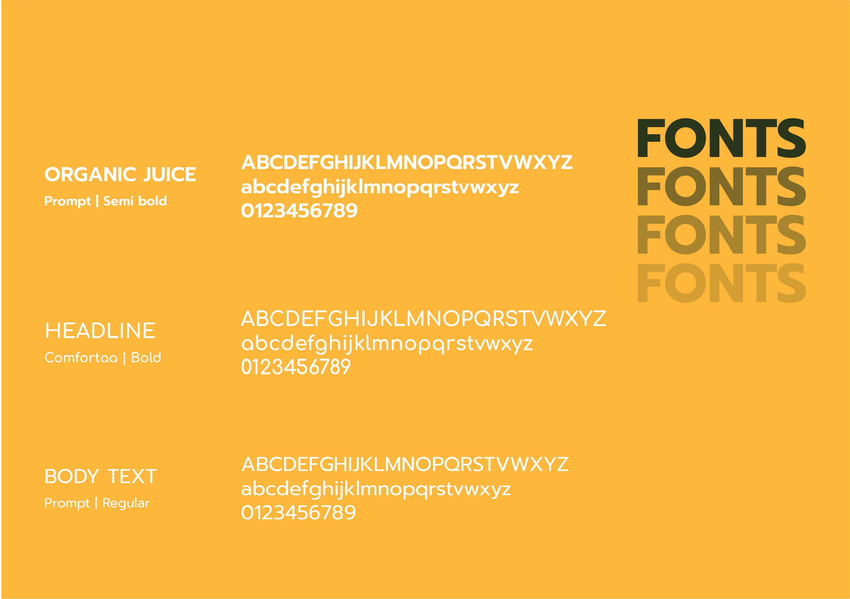
OJU is an organic juice brand designed to embody freshness, vitality, and a youthful lifestyle. The logo integrates visual elements inspired by natural ingredients, reinforcing the brand's commitment to health and authenticity. A vibrant, nature-driven color palette was carefully selected to appeal to a young, energetic audience while communicating freshness and positivity. The custom sans-serif typography features softly rounded terminals, creating a friendly and dynamic personality. This typographic choice avoids rigidity and instead reflects approachability, movement, and modernity—aligning with the brand's youthful spirit and active target market.
Our Team

Anh Tuyet Ngo
Graphic Designer
Andrea (An) Do
Graphic DesignerTools Used


CONCEPT DEVELOPMENT
OUTCOME